Pages

Tuesday, July 17, 2012

The Vitality of Simplicity: Guillermo del Toro's "Angel of Death"


Guillermo del Toro is one of the finest ‘visual storytellers’ working in cinema today, in no small part as a result of his capacity to create imagery that seizes the mind and provokes a powerful emotional reaction. Del Toro’s design sensibilities are brilliantly personified by the creatures he creates, and into which he breaths life by utilizing metaphor and myth.

In this post, I would like to draw attention to an artistic collaboration Guillermo del Toro had with sculptor Norman Cabrera on “Hellboy II: The Golden Army".

When it came time for Del Toro’s interpretation of “Hellboy” to come face to face with his “Angel of Death”, Del Toro created a truly awe inspiring being that is simultaneously horrifying and breathtakingly beautiful in its design. Del Toro asserts, in the films audio commentary, that in this particular world every character has a specific “Angel of Death”. In order to create the "Angel of Death" for “Hellboy”, Guillermo del Toro began by sketching. Below is a Del Toro sketch of the character.


In the sketch, we can already see some of the essential visual notes having been roughed out. The two sets of wings, the eyes on the wings, and the nose and mouth of a cloaked skeleton-like face. In order to bring this concept to full fruition Del Toro collaborated with sculptor and artist Norman Cabrera, who brought a level of detail to the character that allows it to exist in a live action movie. Cabrera must extrapolate from the initial concept and flesh out the director’s vision, and we are fortunate that there is video record of a key series of interactions in that process, seen below.


Norman Cabrera’s first pass on the character clearly displays his mastery of the materials and technical brilliance, and it is hard not to fall in love with the sculpture he created. Guillermo del Toro’s belief in the power of simplicity drives him to do what many of us would find unnerving. Realizing that the head's design will be served with a visual statement that is more austere, he scrapes away the detail on the upper portion of the face and discusses with Cabrera the possibility of flattening it as well as bringing it forward. When the design is revised, the detail is scaled back again in order to create what amounts to the visual equivalent of a crescent moon-shaped empty plate, and that simplicity strengthens the design.

When the character finally made its way to the screen, it gained an asymmetrical crack as well, and the final design possesses a greater vitality as a result of having a visual rest at its focal point.

Tuesday, June 12, 2012

Mythophoric Character Design at ICON7


I will be giving a workshop on "Mythophoric Character Design" as a part of the illustration conference ICON7.  The workshop is titled: Myth, Archetype and Character Design and will take place from 10:00AM - 12:00PM in the RISD Design Center 30 N. Main St., Rm 208.  The workshop will only be open to ICON7 conference attendees who register.

See the ICON7 website for more details.

Sunday, March 18, 2012

JEAN GIRAUD May 8, 1938 - March 10, 2012


"...de l'électricité l'éclair, de l'éclair la lumière.”

Thursday, February 16, 2012

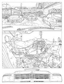
Geof Darrow Part 2: Heir to "Ligne Claire"


“Ligne claire”(“clear line”), exemplified in the ‘sequential art’ of artist Georges Prosper Remi under the pen name “Hergé”, is the single most difficult stylistic approach in which to illustrate ‘sequential art’. The draftsmanship and compositional challenges it presents are daunting, and the manner in which it exposes the artist is unforgiving. An artist has a much more difficult time concealing technical and narrative design flaws in the absence of stylistic marks or large areas of solid black. Today, many artists using “ligne claire” are either reductive in their interpretation or derivative in their approach.

The technical vulnerabilities that the style risks exposing, while significant, are nothing when compared to the manner in which "ligne claire" reveals any deficiencies of investigation or any disconnect between narrative elements and an underlying metaphor. The approach's success only reaches its full potential when an artist possesses the capacity to do both.

Geof Darrow’s work is a truly exceptional example of “ligne claire” in ‘sequential art’, because of the way that his artwork utilizes “linge claire” in a manner that speaks to the time in which we find ourselves living. Darrow’s ability to use this visual language to create a unique voice is largely the result of his inherent authenticity as an artist. Through his work, Darrow is able to accentuate the radiance of the ‘commonplace’ and, very often, the banality of the ‘sacred’.


Darrow’s art displays a profound sensitivity to our modern surroundings, and how overwhelmingly complicated they have become. The visual quality of his artwork acknowledges the relentless nature of modern life and its constant bombardment of sensory stimuli. It is intellectually lazy to classify the complexity and density, present in some of Darrow’s storytelling imagery, as a shortcoming because it fails to abide by the modern belief in the sanctity of simplicity. Darrow’s ability to share his observations and idiosyncrasies, as well as his ability to conjure modern visual metaphors, allow his “ligne claire” work to transcend the twentieth century ideal of paternalism and formula at the expense of nuance and investigation.

While “ligne claire” master Hergé’s art and its ongoing significance, are both a source of celebration and lamentation, what is often overlooked is that his art’s value, as an essential touchstone for us today, is based largely on it being a portrait of the time and place in which it was created. Unfortunately, the popularity and influence of Hergé’s work has inadvertently codified “ligne claire”, as a method, and tethered it to Hergé’s voice as an artist. It is the work of Geof Darrow that has begun to liberate “ligne claire” through the international influences that inform his work, and his ability to examine the cultural landscape as it transitions into the twenty-first century.

It is fascinating to view Hergé’s work and his vision of the twentieth century, today. One can see how its simplicity can be a soothing respite from the twenty-first century and its many complexities(both visual and literal), and it is almost certain that this simplicity was equally soothing to an audience experiencing the horrors of the twentieth. It is similarly soothing for aspiring 'sequential artists' to adopt Hergé's established style and avoid the decades of struggle it took for Hergé to arrive at it.


What Darrow offers us now, is a much-needed affirmation of how our surroundings have changed in the age of industrialism. Darrow’s work allows us to examine a visual landscape teeming with mass-produced, complicated, and instantly disposable packaging and products, that(were they handmade) would surely provoke us to examine them. As Darrow creates visual facsimiles of them by hand, he enriches these objects and calls our attention to them.

The sum of these qualities make Geof Darrow the heir to “ligne claire”. His most compelling work yet is his ongoing series, “The Shaolin Cowboy”. Its trans-genre stream of consciousness narrative, creates mythic imagery inspired by everything from Shintaro Katsu’s “Zatoichi” to Sergio Leone’s Westerns.


If one is interested in exploring the relationship between Hergé's and Geof Darrow's work further, it might be helpful to begin by comparing "Les Adventures de Tintin" and "The Shaolin Cowboy". In particular, noting that both artists include a similar white animal sidekick that seems to always be a step ahead of the protagonist, and the different manner in which the two artists have used sharks as a metaphor in their stories.

Thursday, January 26, 2012

Saturday, January 21, 2012

Geof Darrow Part 1: "The Art of Attention"


Geof Darrow's art has made great contributions to both ‘sequential art’ and cinematic conceptual design. The success of his work is often misunderstood as being achieved by its abundance of what many refer to as ‘detail’. The term ‘detail’ is far too inclusive or inaccurate to be used to describe the quality of Darrow’s work that makes it great. Praising his work for the amount of ‘detail’ it possesses would be shallow praise, and it would overlook what is truly exceptional about Darrow’s work. Geof Darrow’s supreme qualities as an artist are his power of observation, the depth of his investigation, and his ability to translate his insights into art. What makes his work truly exceptional is Darrow’s practice of “the art of attention”.

Below are some examples of Darrow’s conceptual art from the Wachowskis' film series “The Matrix”. The art is a product of fantasy, and while it possesses ‘detail’, the art is not driven by a need to create quality by means of its quantity of marks. Instead, Darrow utilizes his years of observation, exploration, and investigation to inform the visual metaphors he is charged with communicating.

What differentiates Geof Darrow, as an artist, is the quality of the individual elements his designs possess. They do not weaken or distract from the meaning he is intending to convey as a whole, because of the intelligence he brings to the visual choices he makes.

The “used future” that was a hallmark of the film “Star Wars” in 1977, is one of the most misunderstood aesthetic concepts of modern visual design. ‘Detail’, in the work of the novice artist (and the mind of the incurious) depicts worn or broken objects that cannot be imagined as new or whole, and visual elements that assault the viewer without informing them. Geof Darrow's work has a truly unique capacity to enrich any viewer or student willing to investigate and acknowledge the level of ‘attention’ that informs it.

If we all practiced “the art of attention” that Geof Darrow brings to his work, our own work would be better for it.

In a lecture entitled, “It Doesn’t Matter if You Die for It”, which I have embedded the second part of below, Jiddu Krishnamurti articulates “the art of attention” beautifully from 02:00.